

M&G
Featured Projects
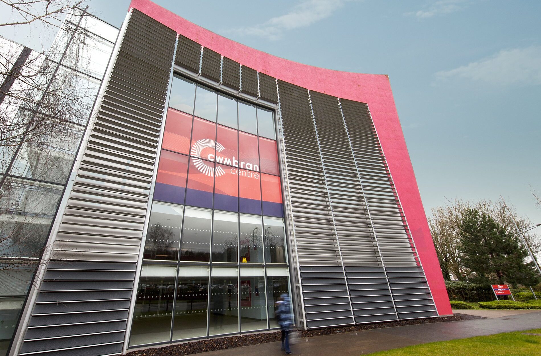
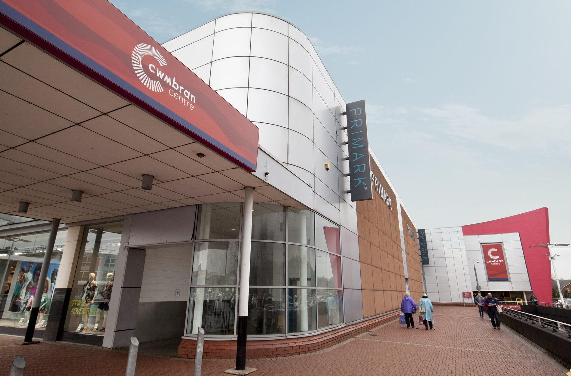
One of Wales’ largest outdoor shopping centres required a full rebrand and improved signage system to enhance the visitor experience and bring greater clarity and cohesion to the site. The challenge was to create a distinctive identity that could unify the large-scale environment while remaining flexible across diverse spaces.
Branding & Strategy
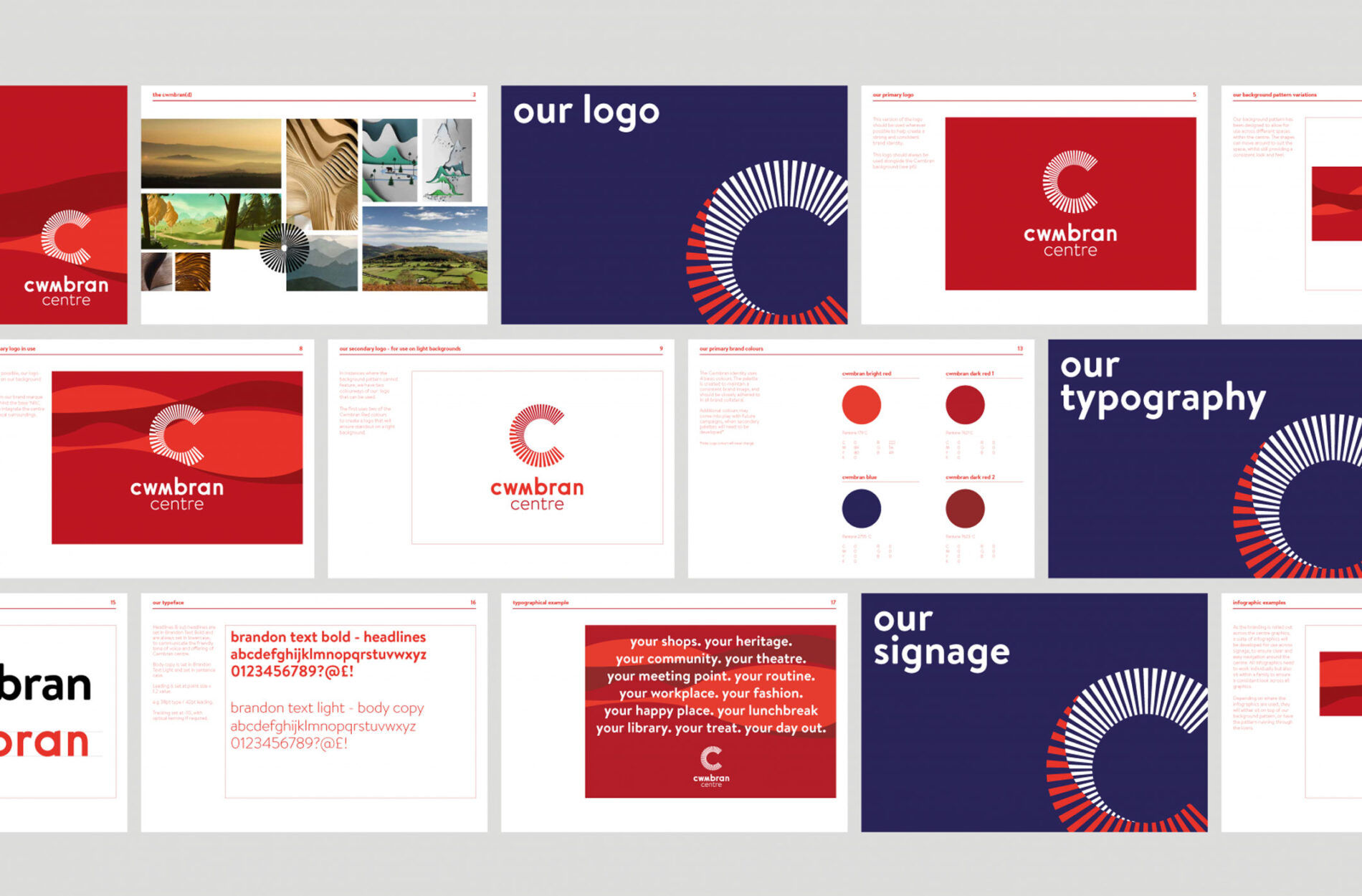
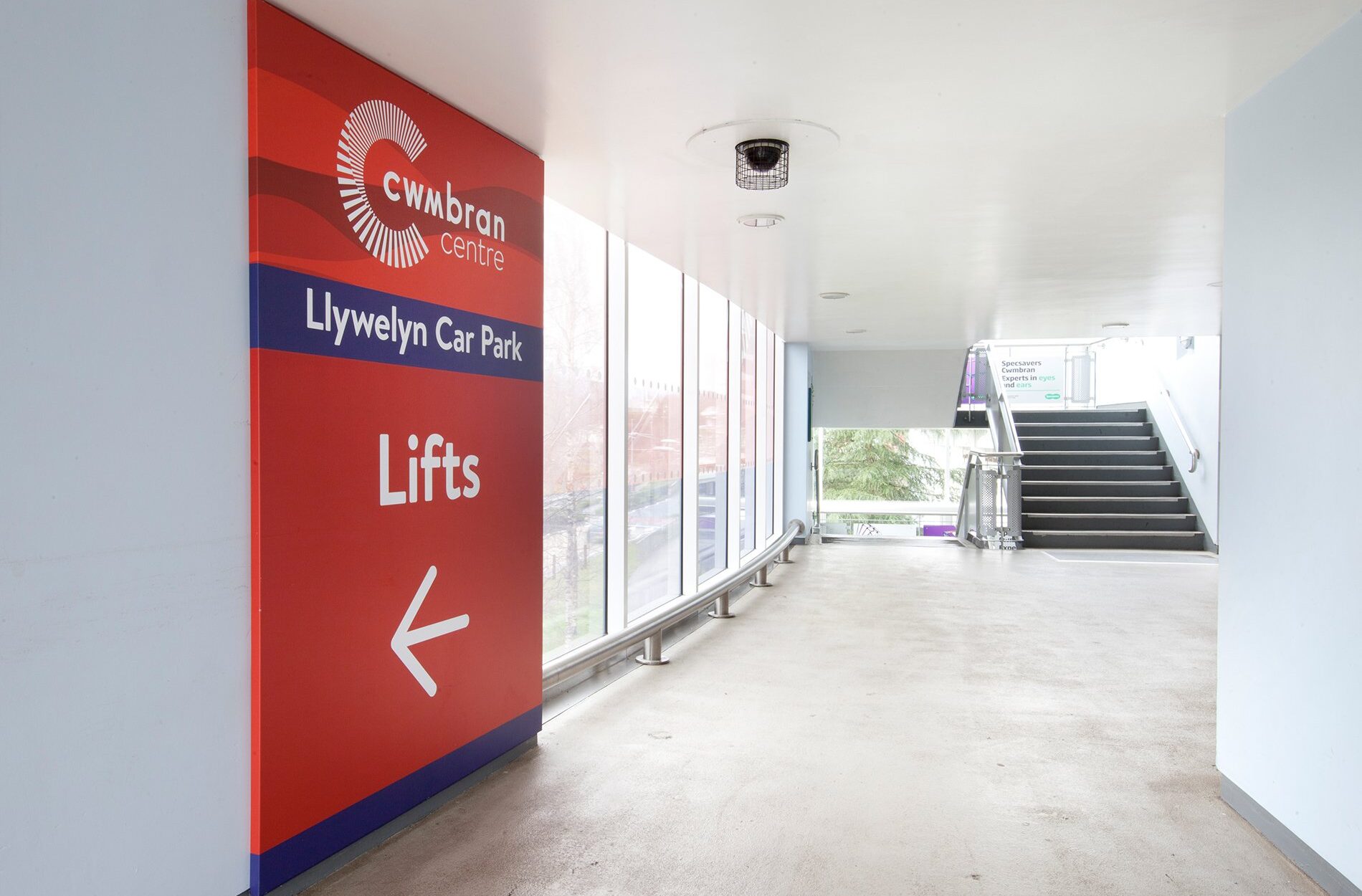
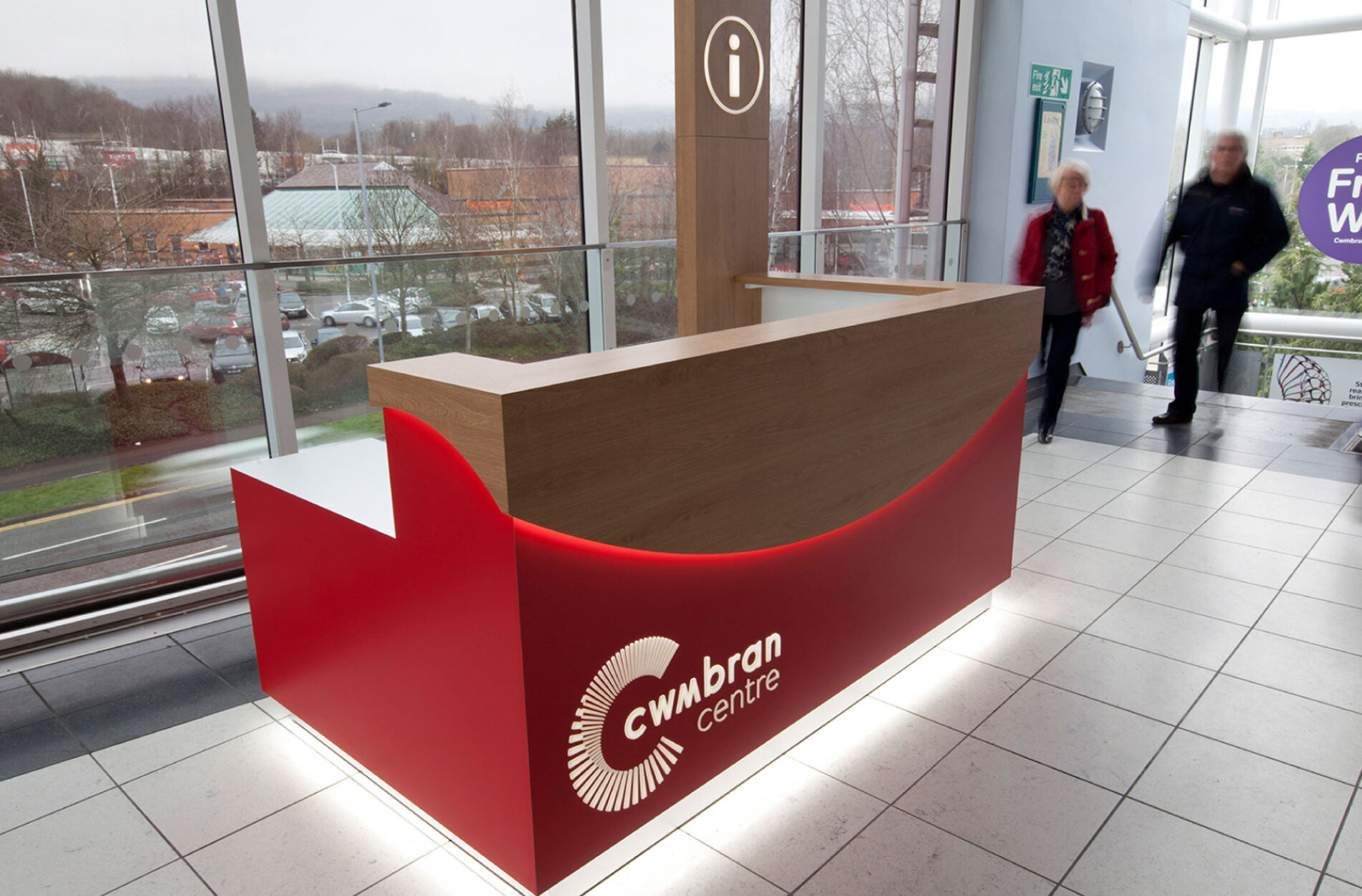
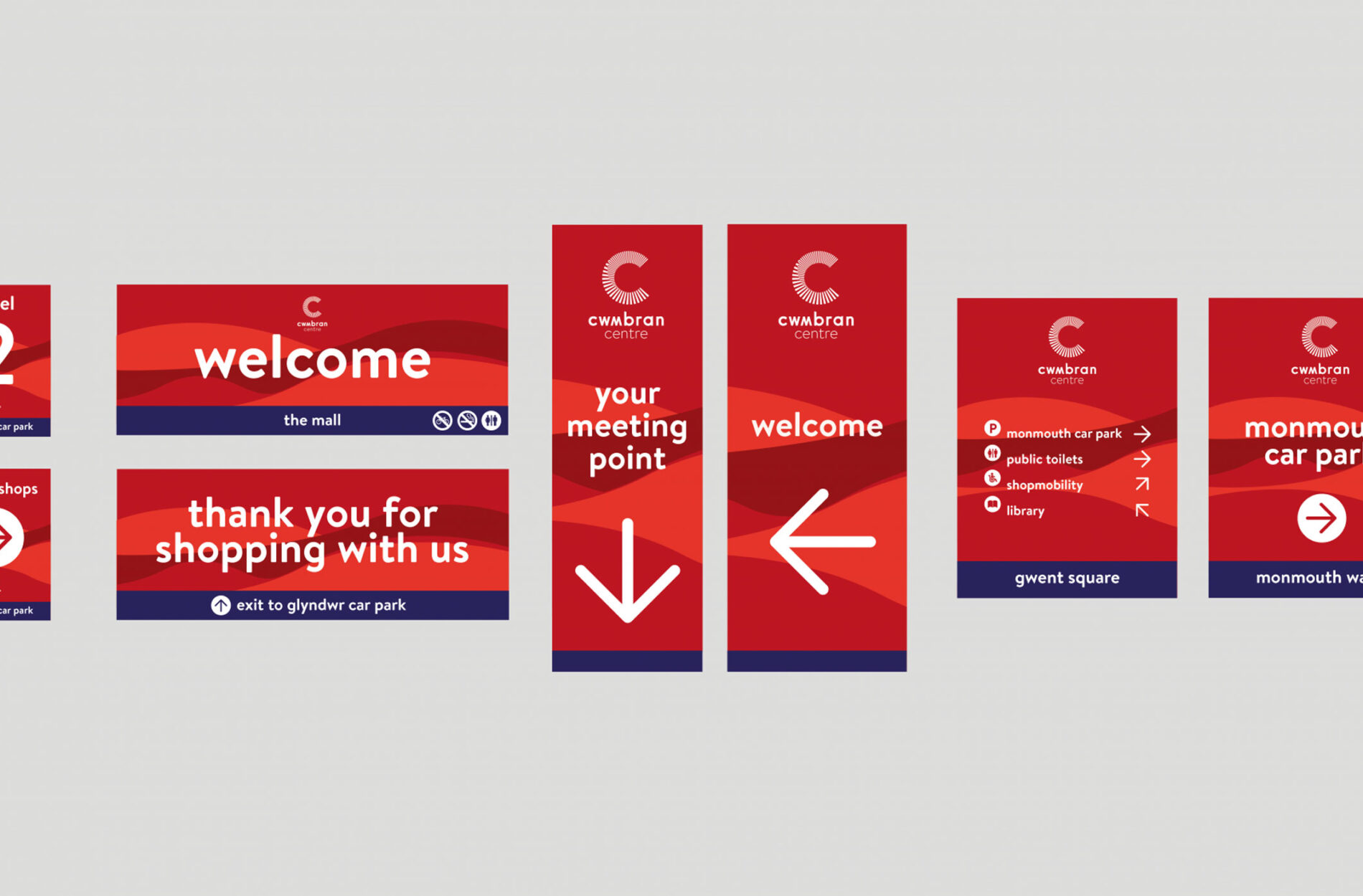
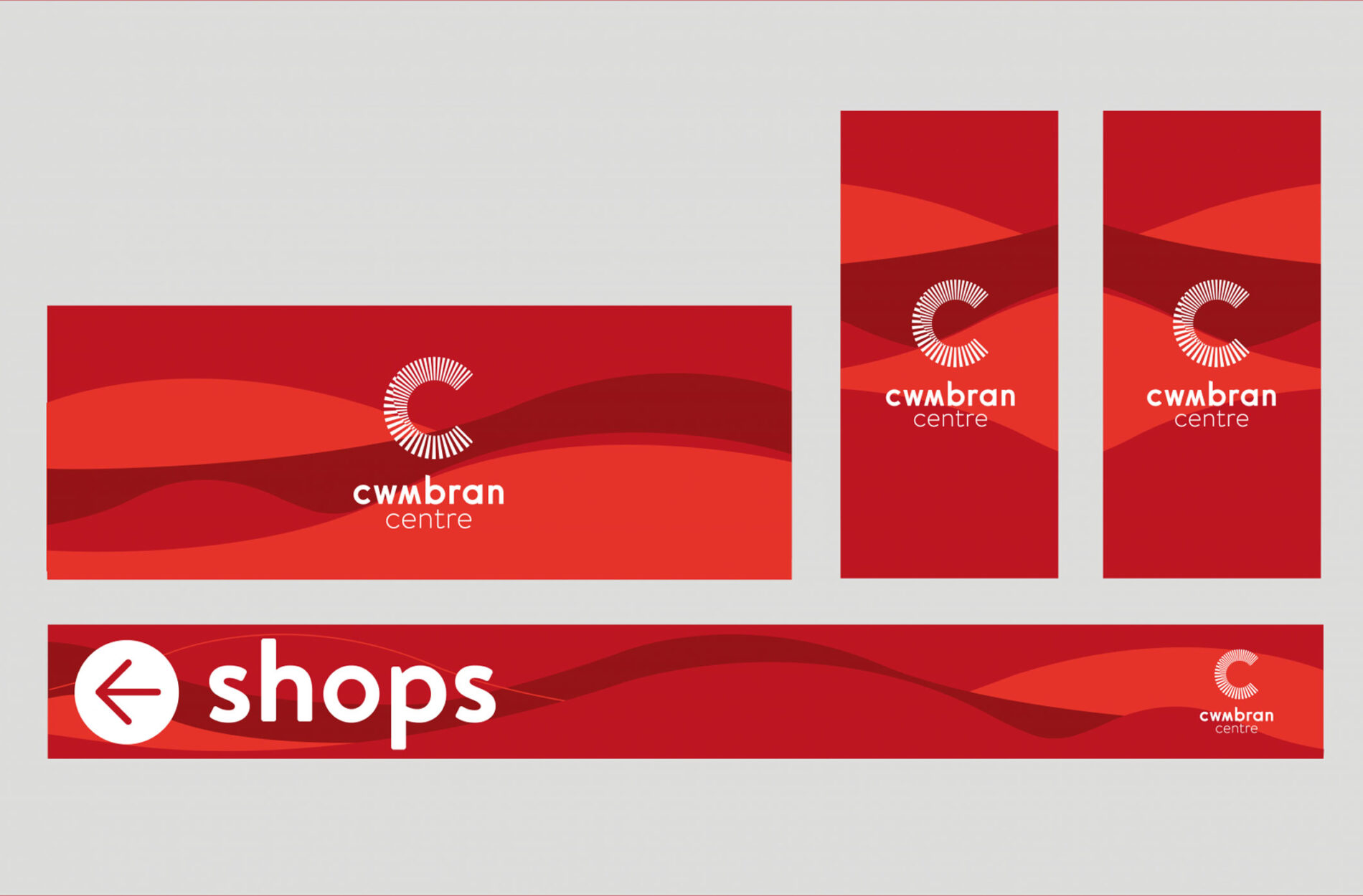
We developed a new brand identity inspired by the surrounding Welsh hillsides, creating a strong connection to the local area. This identity was applied to over 1,200 signs across the site, delivering a consistent and engaging brand experience.
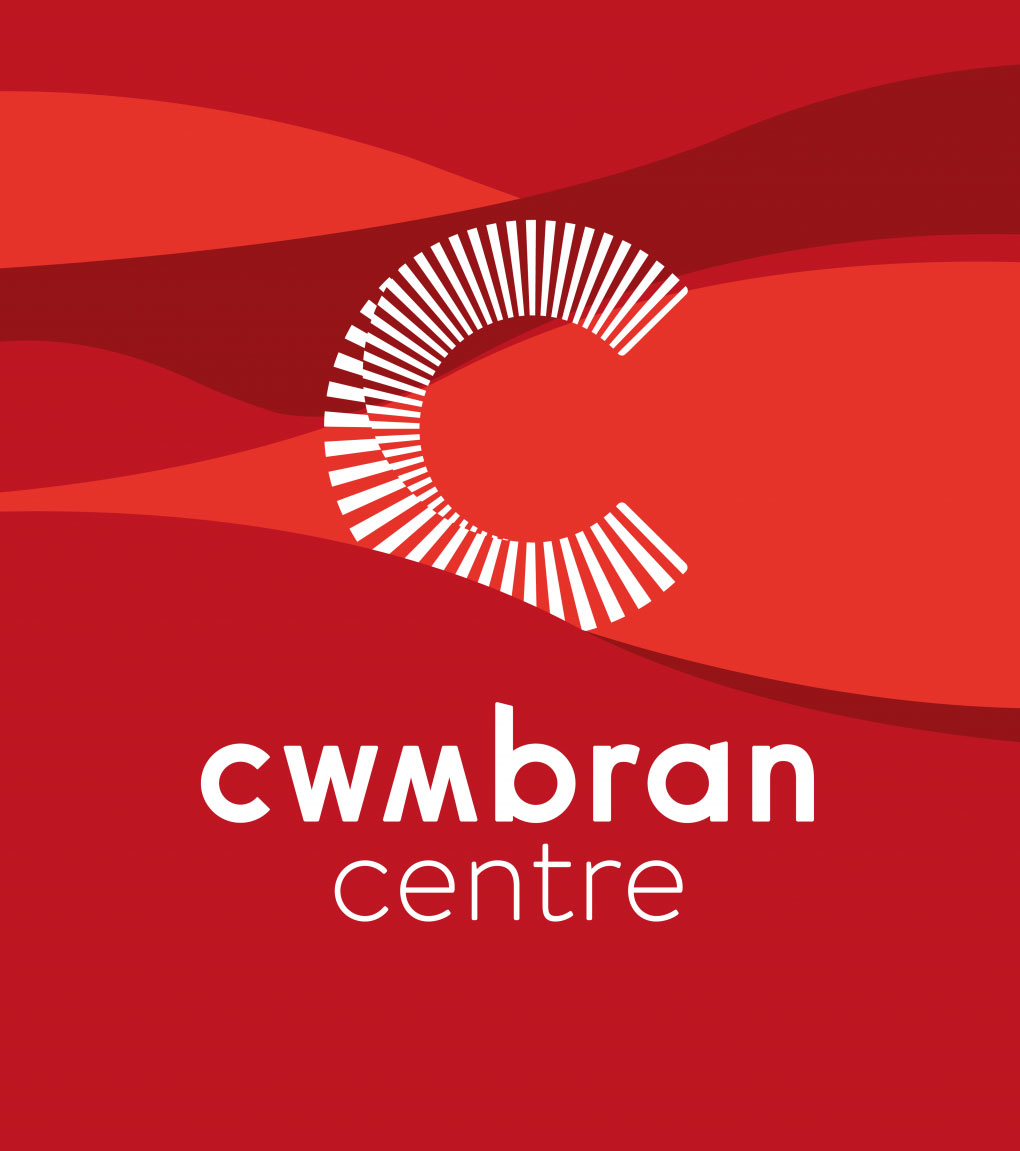
A custom background pattern was designed to adapt fluidly across different formats and environments – its flexible structure allowing it to shift and scale while maintaining visual unity. The introduction of bright red signage established a bold and recognisable visual language that simplifies wayfinding and sets a strong foundation for all future communications and activities.
Signage & Wayfinding
The new identity was rolled out across signage and wayfinding across the centre, to make a clearer, more connected customer journey.
The new design language brought consistency to key journeys throughout the centre, helping visitors navigate more easily between entrances, retail areas, facilities and parking, along with creating a more welcoming first impression.
Impact
The rebrand and comprehensive signage rollout have transformed the centre into a more navigable, welcoming, and visually cohesive destination. Together, the identity and wayfinding improvements enhanced orientation, reduced friction in the visitor experience and gave the centre a stronger, more unified presence.
The new identity has helped reinforce the centre’s status as a key shopping and leisure destination in Wales.
"Beyond have created and delivered a much improved, modern customer experience for our visitors. The materials and colours have unified the visitor experience and delivered a wonderful atmosphere for shoppers to enjoy."
The Friary Centre Manager
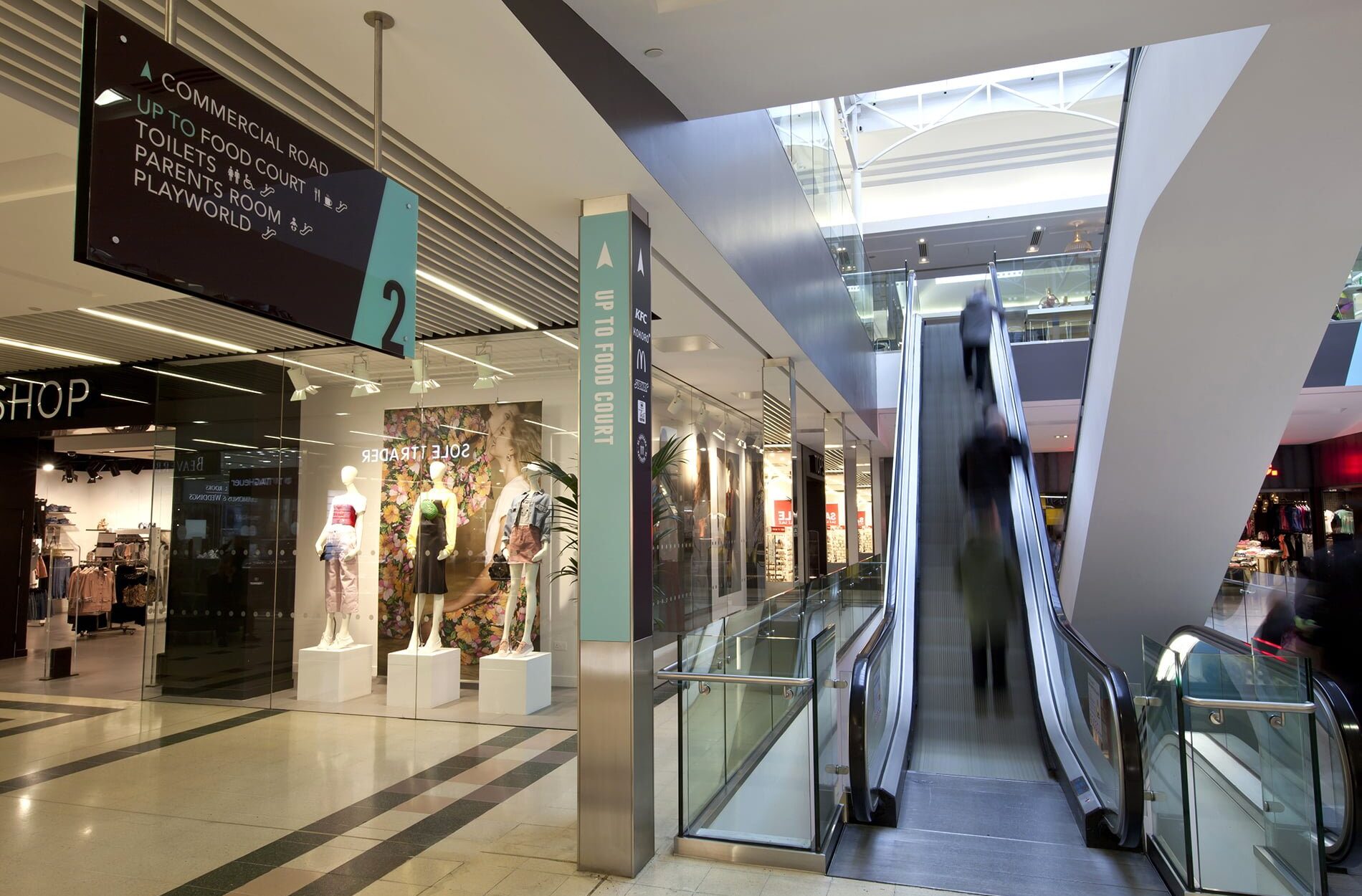
The Friary was facing a number of challenges that impacted both visitor experience and brand perception. Entrances lacked clear visual identity, the existing design did not reflect the centre’s updated branding, resulting in a lack of cohesion and diminished impact. Outdated and inconsistent signage made navigation confusing, leading to a disjointed journey through the space. These issues resulted in the need for a comprehensive redesign to improve functionality, aesthetics, and alignment with the centre’s new brand direction.
Signage & Wayfinding
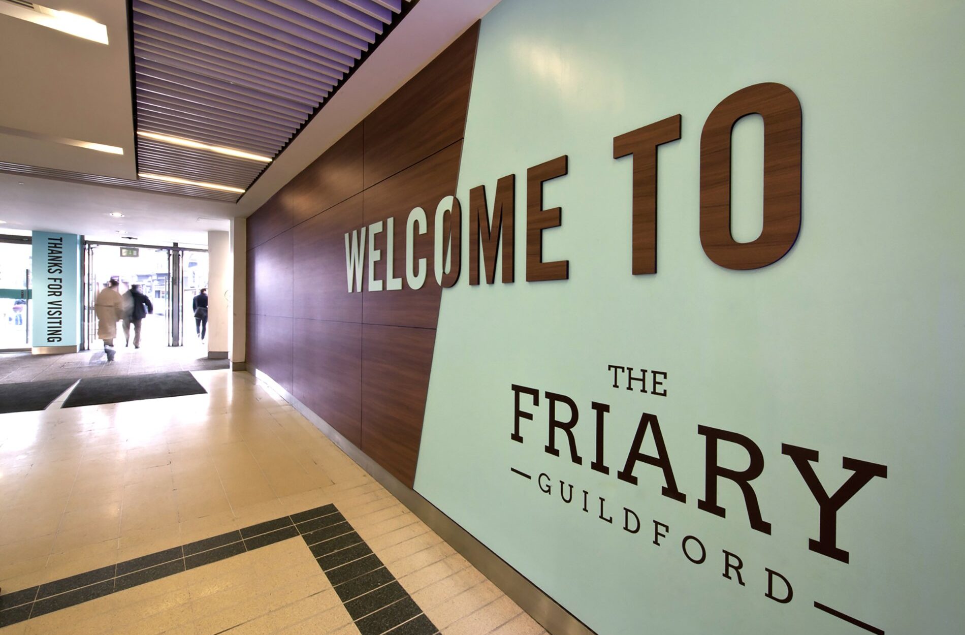
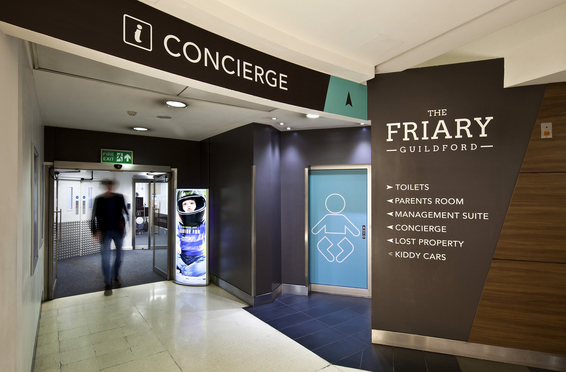
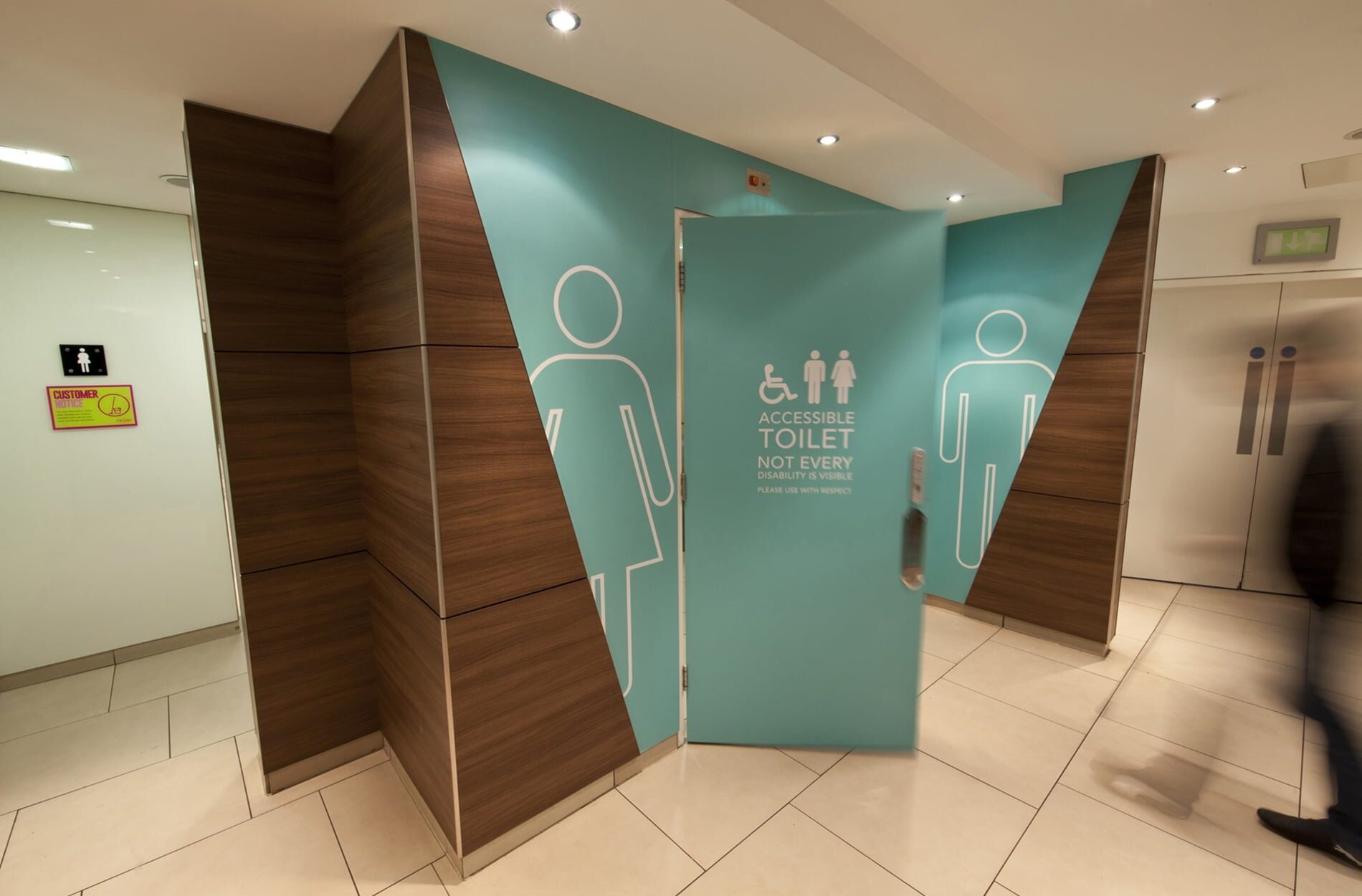
We developed new interior design and signage concepts to enhance the visibility and impact of the centre entrances by introducing feature welcome walls. These were complemented by a refreshed, intuitive wayfinding system that makes navigation easier for visitors, unifying the space under newly rolled out branding and improving the overall customer experience.
Impact
The new feature welcome walls created strong visual gateways at each entrance, making the centre more inviting and easier to identify. Clear, consistent, and strategically placed wayfinding signage significantly improved navigation, reducing confusion and enhancing flow throughout the space.
Most importantly, the updated design elements brought the new branding to life across the entire centre, creating a cohesive and modern environment that better reflects the centre’s identity and values. The result is a more welcoming, user-friendly, and engaging destination for all visitors and tenants.
Beyond have created and delivered a much improved, modern customer experience for our visitors. The materials and colours have unified the visitor experience and delivered a wonderful atmosphere for shoppers to enjoy.
The Friary Centre Manager